
Branding a Bootstrapped Billion-Dollar Consulting Firm
Built brand identity and website for a $3.2B bootstrapped consulting firm. The strategic challenge: communicate global scale and credibility with limited marketing resources.
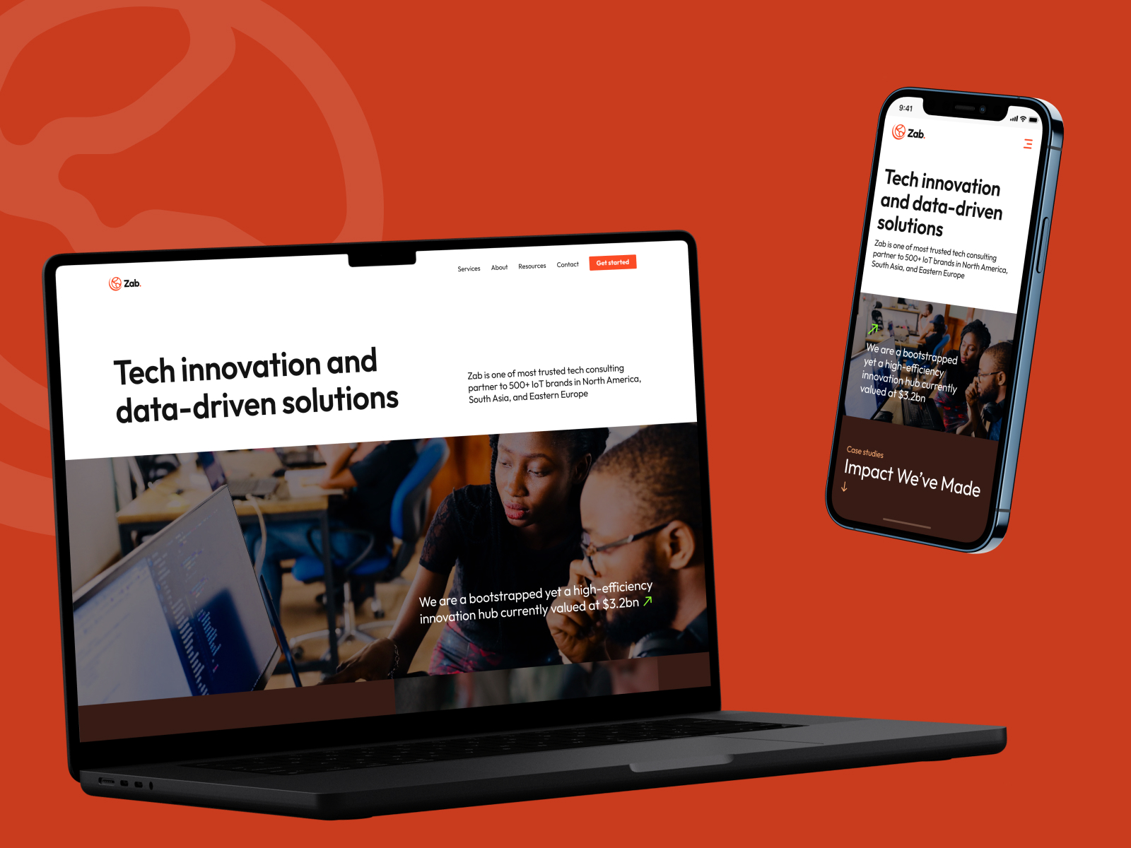
Zab is unusual: bootstrapped, global, and valued at $3.2B. Yet the brand presence was invisible compared to competitors with 100+ employee marketing teams.
The business strategy was clear: reach enterprise buyers evaluating a consulting partner, and growth-stage companies looking for technical direction. The brand had to punch above its weight.
Product
Zab.
My role
Brand and Product Strategy Lead
Timeline
2024
Skills
Brand Strategy, Market Positioning, Visual Systems, Information Architecture
Market Position and Constraints
Zab operates at a unique market position: credible with enterprise clients (that's the work), but approachable to growth-stage companies. The website had to appeal to both without feeling generic.
Business constraint: Zab is bootstrapped. There's no $2M marketing budget. Every design decision had to earn its place. Nothing could be decorative. Every visual element had to communicate credibility or competence.
The competition: consulting firms with 500+ employees and corporate presence. Zab had 8 people globally. The brand had to communicate that Zab is not smaller, just more focused.
Strategic Brand Decisions
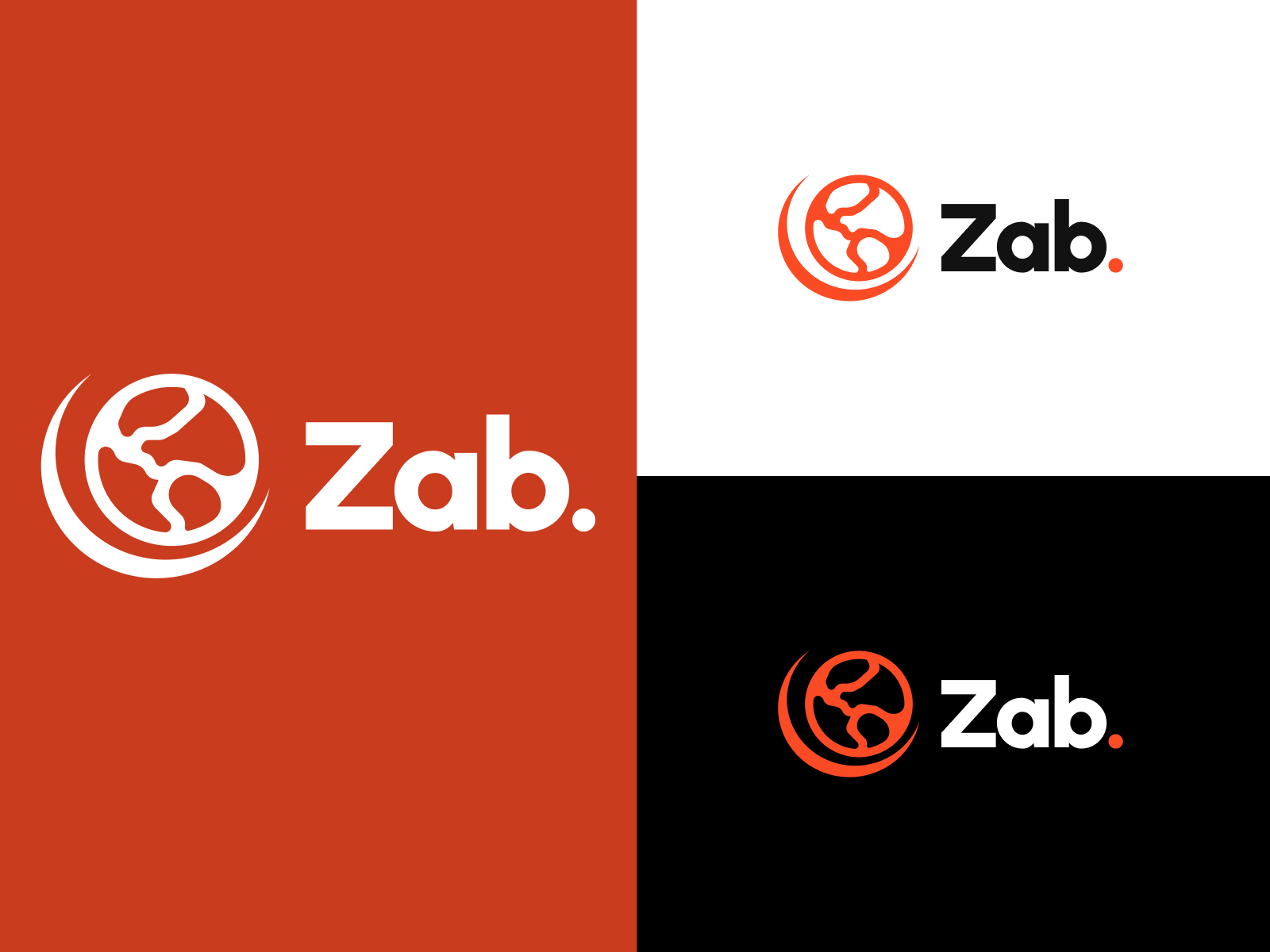
Decision 1: Signal three-continent presence without being literal. A globe mark references the geographic reach, but the circuit-board pattern inside it anchors the IoT focus. It communicates reach to the decision-maker and specialization to the technical audience.
Decision 2: Own a bold color. Orange breaks through the tech consultant generic aesthetic (blue and gray everywhere). It's confident without being loud. It scales from business cards to billboards.
Decision 3: Emphasize real people, not stock photos. Consultants sell trust. Generic photos undermine that. Real people in real work environments communicate authenticity.
Decision 4: Information architecture over decoration. The homepage flows: Hero (value prop), Services (five pillars), Testimonials (social proof), Case Studies (proof of work), Contact (low friction). No animations, no parallax, no trends. Just clarity.
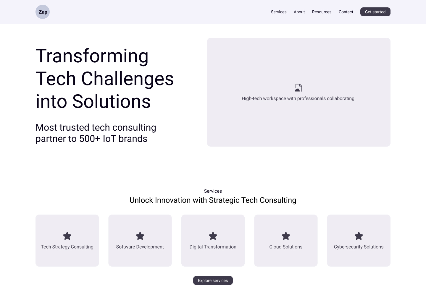
Design Rationale: Build for Sales Conversations
Identity system that scales
Logo works at favicon size and billboard size. Color system is consistent across digital and print. No special cases.
Five clear service pillars
Tech Strategy, Software Development, Digital Transformation, Cloud, Cybersecurity. Each links deeper for those who want to explore.
Client outcomes, not vanity metrics
Case studies show problems solved, not project counts. Social proof shows actual client testimonials.
Contact form, calendar link, email
Three ways to start a conversation. Low friction matters when your buyer is a VP of Engineering with 20 decisions daily.
Business Outcome
Inbound inquiry quality
Website attracts the right decision-makers. Inquiries are pre-qualified by the time they hit the inbox.
Brand recognition in market
Five-pillar structure became the way Zab talks about itself internally. Sales uses it. Content uses it. It unified the narrative.
Global credibility on limited budget
No paid marketing needed. Referrals and organic search drive most traffic. Brand does the heavy lifting.
Strategic Insight
You can't fake scale with design. You can communicate focus and competence. Zab's brand isn't trying to look like a 500-person firm. It's communicating that eight people, globally distributed, can do what 500-person firms do. That's more credible than pretending to be bigger.