
Unifying Fragmented Marketing Data Into One Dashboard
Built a consolidated reporting platform that reduced agency manual work and unlocked a new product line. Owned the design strategy from problem validation through post-launch optimization.
Strique faced a fundamental business constraint: agencies couldn't sell their services without proof. Manual report assembly was a bottleneck to customer acquisition and retention.
I owned the design strategy to transform fragmented data across four platforms into a sellable, customer-facing product. This required solving for data consistency, multi-audience needs, and operational constraints simultaneously.
Product
Strique
My role
Lead Product Designer
Timeline
Q3-Q4 | 2023
Skills
Product Strategy, Data UX, Systems Design, Stakeholder Alignment
Business Context
Strique's core customers are performance agencies and D2C brands. These teams run campaigns across Meta, Google, TikTok, and email simultaneously. Before this product, reporting meant opening four separate dashboards, cross-referencing different date ranges and attribution models, then manually assembling results in spreadsheets.
This created two problems: agencies lost billable hours to report generation, and they couldn't differentiate themselves to clients. The business couldn't scale without solving this.
The strategic opportunity was clear: if we could automate reporting and make it client-ready, we unlock a new value proposition. Agencies could spend more time on strategy instead of spreadsheets. We gain a stickier product metric.
Constraints and Tradeoffs
Meta, Google, and SEO platforms report metrics differently. Attribution windows, conversion definitions, and data update frequencies are all over the map. Any unified report either gets bogged down in disclaimers or becomes inaccurate.
Two opposing user types: executives who want a headline number, and media buyers who need granular campaign performance. You can't serve both with the same interface.
The core tradeoff: opinionated defaults versus flexibility. Custom reporting tools are powerful but overwhelm users. I chose opinionated templates that cover 80% of use cases (the Founder's Report template) with a custom builder available for power users who need it.
This decision reduced onboarding friction and meant faster time-to-insight, but it meant saying no to highly customizable workflows.
My Role and Key Decisions
I owned the design strategy end-to-end: problem framing with the product team, user research to validate the opinionated template approach, and post-launch iteration based on usage data.
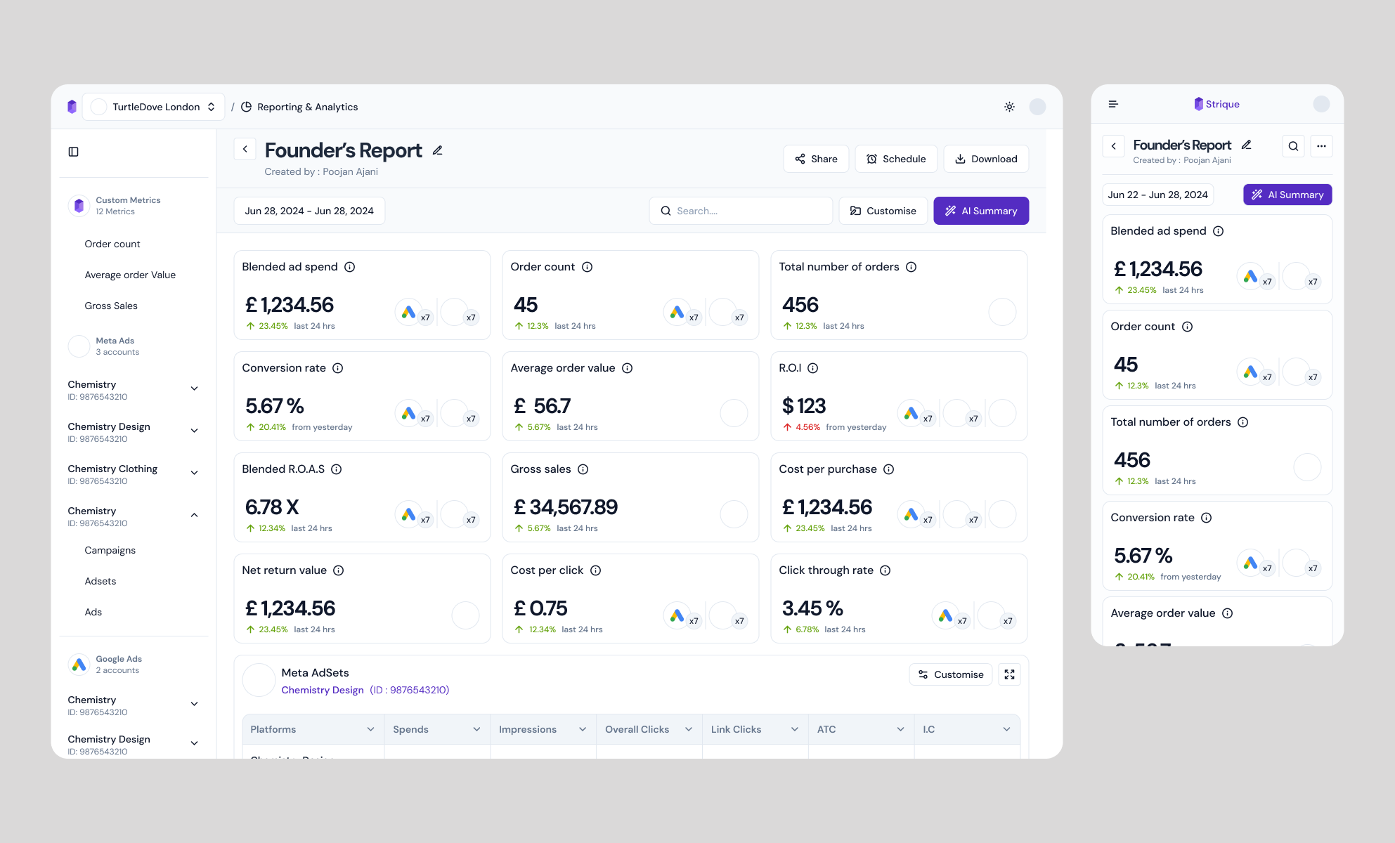
Decision 1: Information hierarchy by user role, not by data volume. Top row: revenue, ROAS, CAC. These are the metrics executives care about. Bottom rows: channel-level performance and campaign granularity for media buyers to drill down without leaving the report. This structure kept both audiences in one view without compromise.
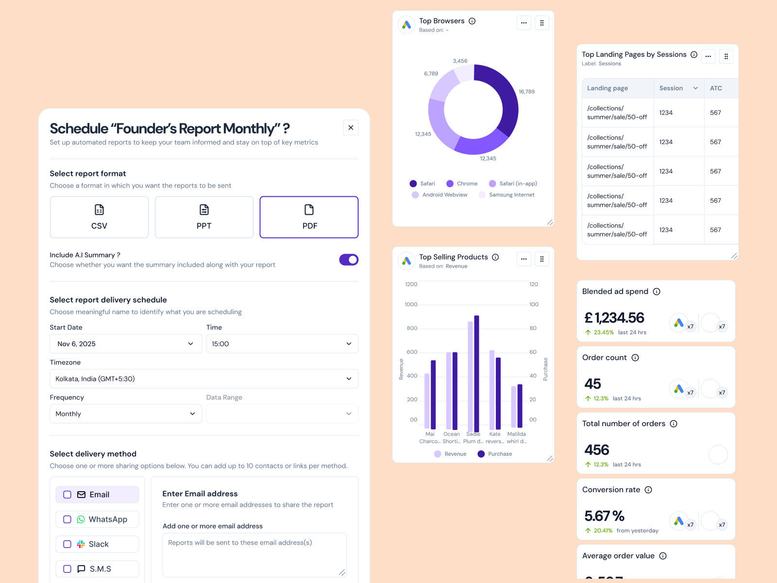
Decision 2: Treat constraints as design features, not friction. When agencies hit SMS delivery caps, we flag it inline instead of blocking the flow. They can see exactly what's unavailable and adjust. This turned a limitation into an educational moment.
Decision 3: Automation where it matters. The AI summary button converts a dense metric grid into a narrative. Not all stakeholders parse numbers quickly. By generating a plain-language summary of the same data, we made the report accessible to finance and executive teams, expanding its utility.
Design Rationale
Rapid insights without context switching
Three-tier information hierarchy lets any user find their answer in seconds. Executives read the top, media buyers dig deeper without changing context.
Data consistency through opinionation
Pre-built templates enforce a single source of truth. Custom filters apply globally. Users never see conflicting numbers from different reports.
Distribution as a design feature
One-click PDF and shareable links go straight to clients. No manual formatting or layout work. This became a key selling point to agencies.
Progressive disclosure for power users
80% of users stay within templates. Advanced users get a custom builder. Complexity is optional, not mandatory.
Complete view of unified data

All data unified: Meta, Google, TikTok, and email in one scrollable report
Measurable Outcomes
4 tools to 1 dashboard
Agencies stopped toggling between four separate platforms. Time to generate a client report dropped from 2-3 hours to under 15 minutes.
Template adoption rate
87% of reports generated used the pre-built Founder's Report. Only 13% required custom configuration, validating the opinionated strategy.
Report distribution
Client-ready PDFs and shareable links became a key sales talking point. NPS lifted specifically on this feature.
Customer retention signal
Agencies using automated reporting showed higher expansion rates. The product became a lever for upsell conversations.
Strategic Insight
This project taught me that design at the product level means solving for business constraints, not just user friction. The real problem wasn't UX. It was that manual reporting was a unit economics drag and a sales blocker. Once we framed it as a strategic business problem, the design became obvious: opinionated templates that respect mental models and save time.