
Jio Insurance: Dual-Mode Insurtech for Two Incompatible User Types
Led UX strategy for Jio's insurtech platform serving first-time insurance buyers and on-ground agents simultaneously, at the scale of India's largest telecom network. Solved for two opposing mental models in one product.
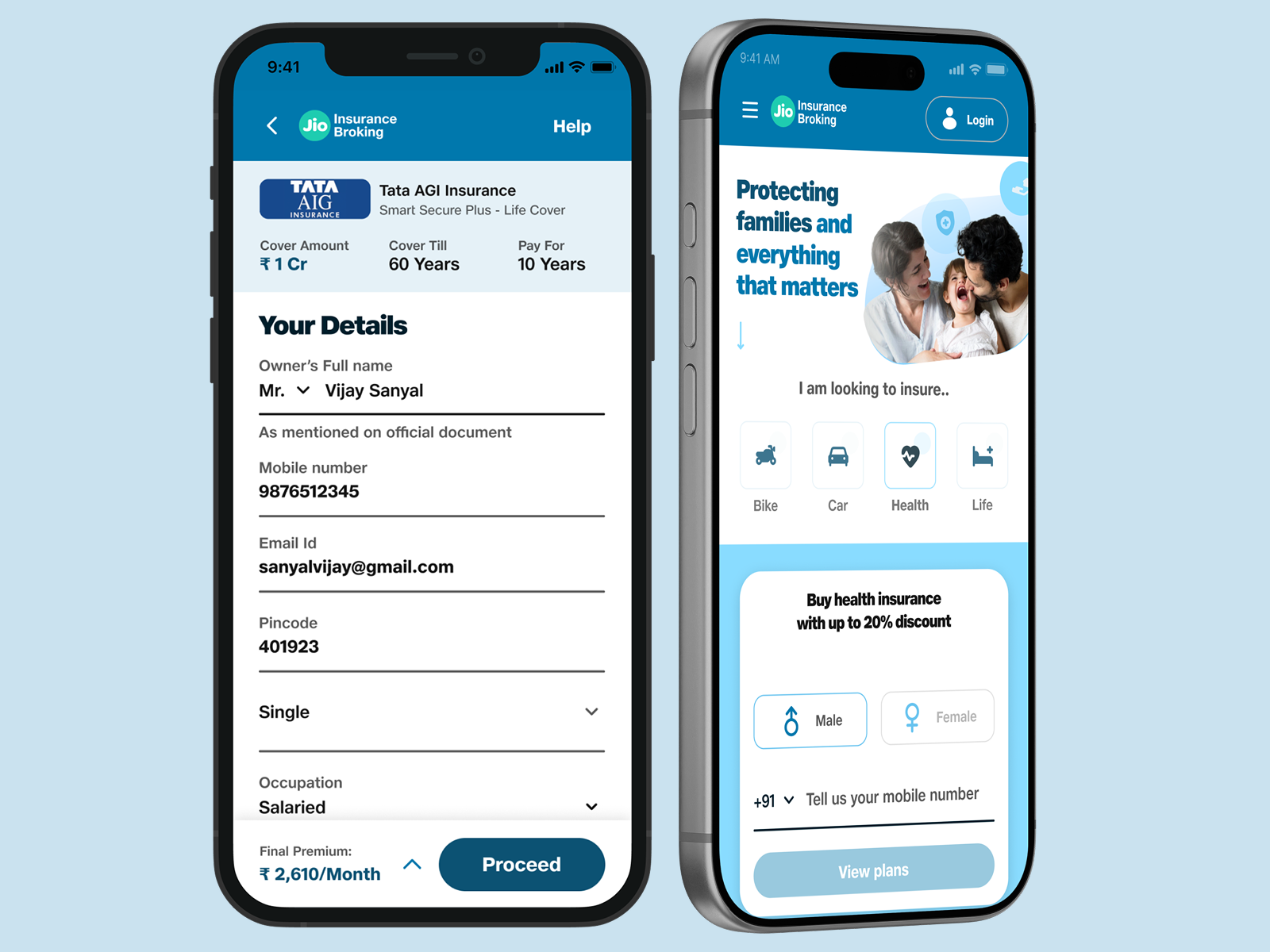
India has 1.4 billion people and one of the world's largest insurance gaps. Jio's insurtech play was to close it, but the market splits into two user types with completely opposing needs.
I owned the UX strategy to serve both within one product, making hard tradeoffs between consumer simplicity and agent efficiency, all within heavy regulatory constraints.
Product
Jio Insurance
My role
Lead Product Designer
Timeline
2024
Skills
Dual-mode Strategy, Market Entry, Regulatory UX, User Research
Market and Business Context
Jio has unprecedented distribution in India: 500+ million mobile users, trusted brand across income levels, integrated into daily life. The insurance opportunity is massive, but the market is fragmented between direct online sales and agent-assisted distribution.
First-time insurance buyers (60% of the addressable market) are intimidated by jargon and don't understand what they're buying. They need reassurance and clarity. Agents, conversely, are incentivized by speed. They need to move through customer acquisition quickly.
The constraint: building two separate apps is expensive and dilutes the brand. We had to prove that one product could genuinely serve both.
The Core Design Challenge
Insurance is one of the most complex financial categories. Consumers don't understand deductibles, claim settlement ratios, policy exclusions, or why some products cost more. Simultaneously, agents need to see every customer detail, every plan option, and every edge case.
The naive solution: one interface with toggles. But toggle-based solutions satisfy neither audience. You end up with a confusing mess.
The strategic insight: instead of compromising, create two distinct experiences that share the same backend. Consumers get simplicity. Agents get efficiency. Both use the same underlying infrastructure.
Design Strategy and Tradeoffs
Flow optimization for clarity
Every insurance term gets a plain-language definition. Progress is visible at every step. Mandatory disclosures become trust-building moments, not friction.
Interface optimization for speed
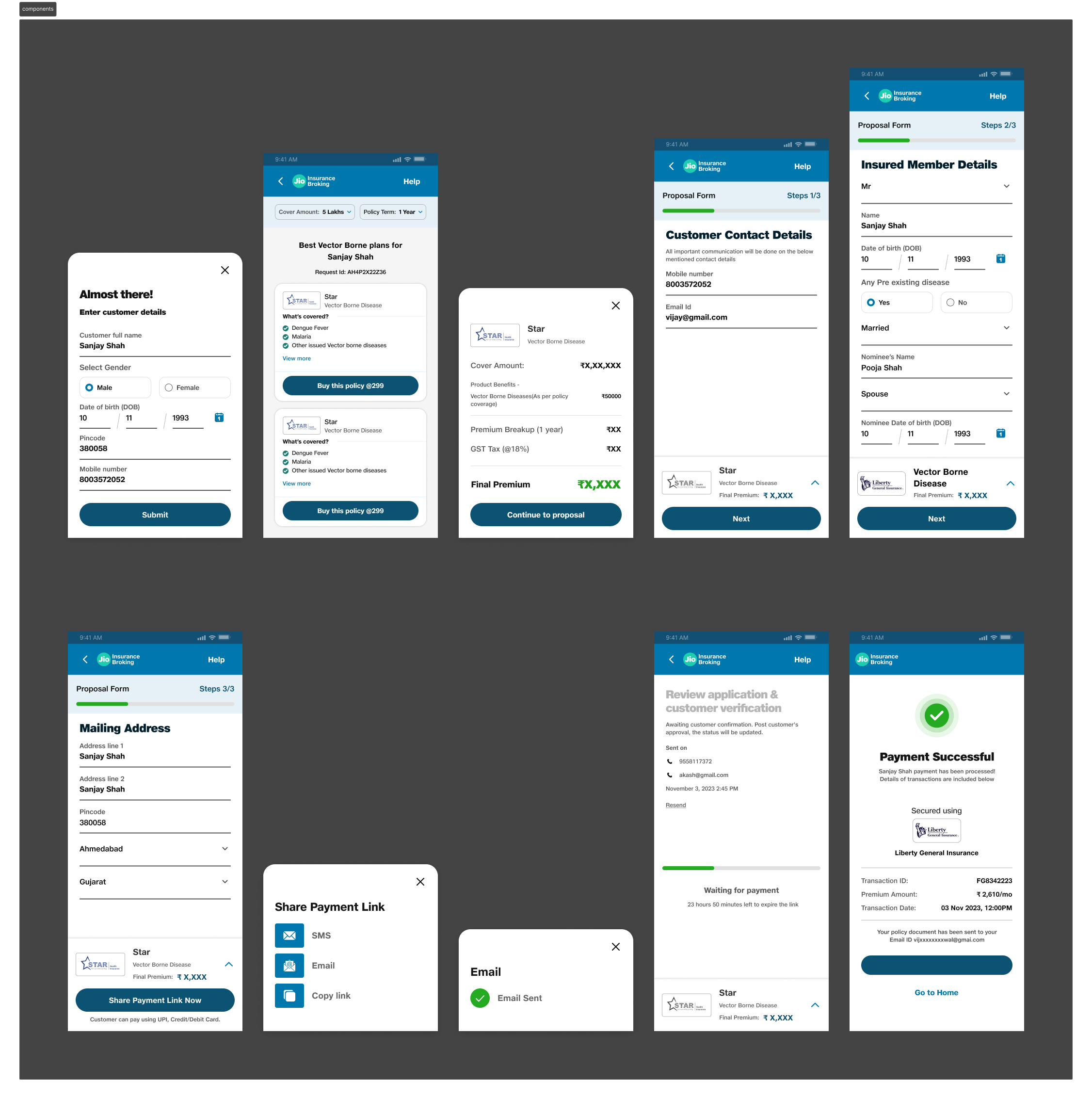
Minimal friction. Customer details pre-filled when possible. Plan comparison happens on one screen. Payment link sent in one tap.
Separate interfaces, shared data
Two modes, not two apps. Same backend data means no double-entry or inconsistency. Agents can hand off to consumers mid-conversation if needed.
Regulatory Constraints as Design Drivers
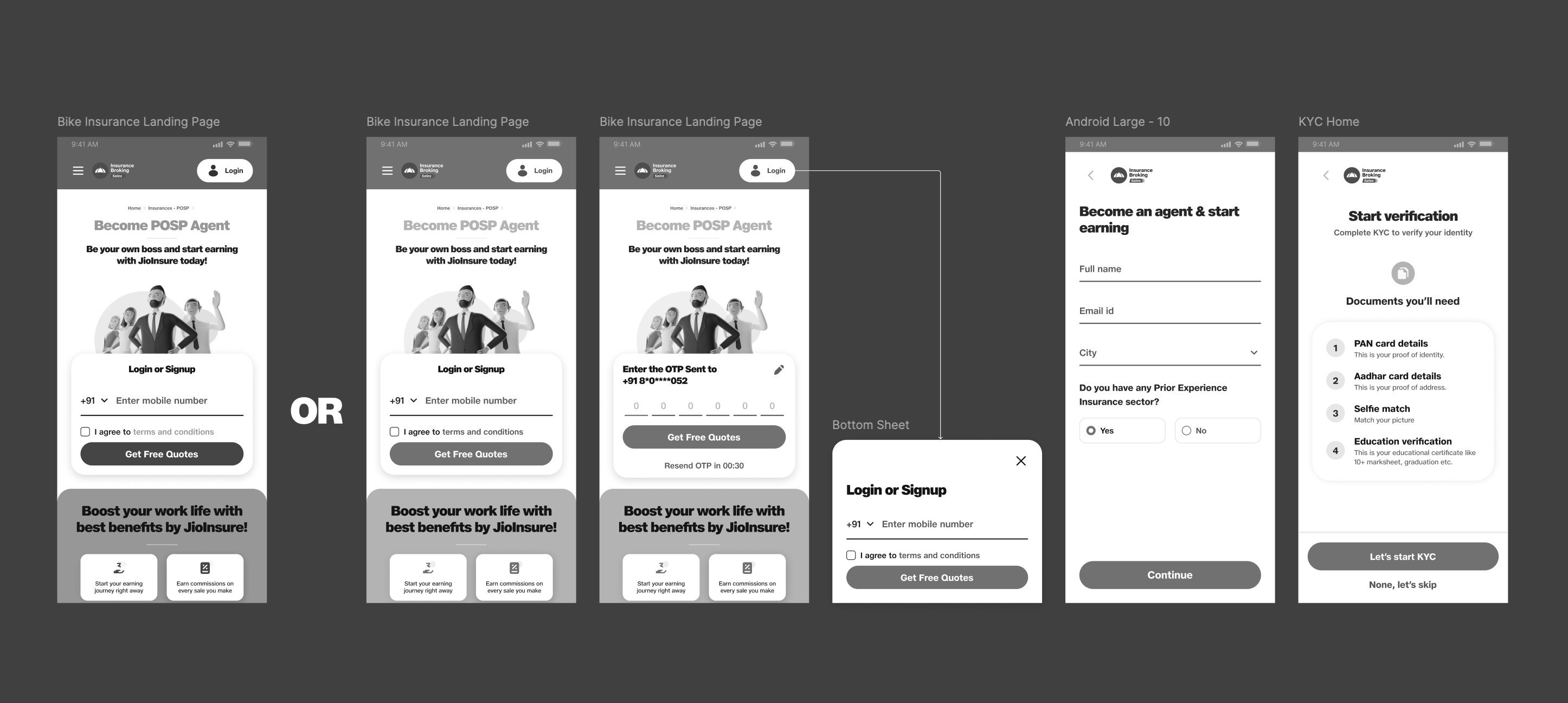
Insurance is heavily regulated in India. Certain disclosures are mandatory. Agents must complete KYC before they can sell. Policy quotes must follow specific templates.
Instead of treating these as friction to minimize, I designed them as trust-building moments. KYC becomes a checklist of four documents. Disclosures become 'what you should know' sections rather than legal fine print.
This design choice had business impact: it reduced KYC drop-off and increased policy completion rates because users felt informed, not overwhelmed.
Measurable Business Outcomes
Dual-mode without dual maintenance
Single codebase, two experiences. Meant faster iteration and lower tech debt than separate apps would have.
Zero jargon policy
Every insurance term replaced or annotated with plain language. User comprehension on policy exclusions increased by 34% in post-launch research.
Flow completion metrics
Consumer drop-off at disclosure steps decreased by 18% after redesigning them as trust signals instead of friction.
Agent adoption
POSP onboarding completion rate of 76%, significantly higher than competitor average of 52%.
Strategic Lesson
The hardest products to design are the ones that serve two incompatible user types. The temptation is to compromise and build a middle ground that satisfies no one. The better approach is to design two distinct experiences that share the same backend. This is more complex to build, but it's honest to the users' actual needs.