
UX as a Unit Economics Problem
Designed three core flows for a merchant platform serving 500K+ SMEs in India. The product challenge: low-income users, variable device quality, and support cost constraints.
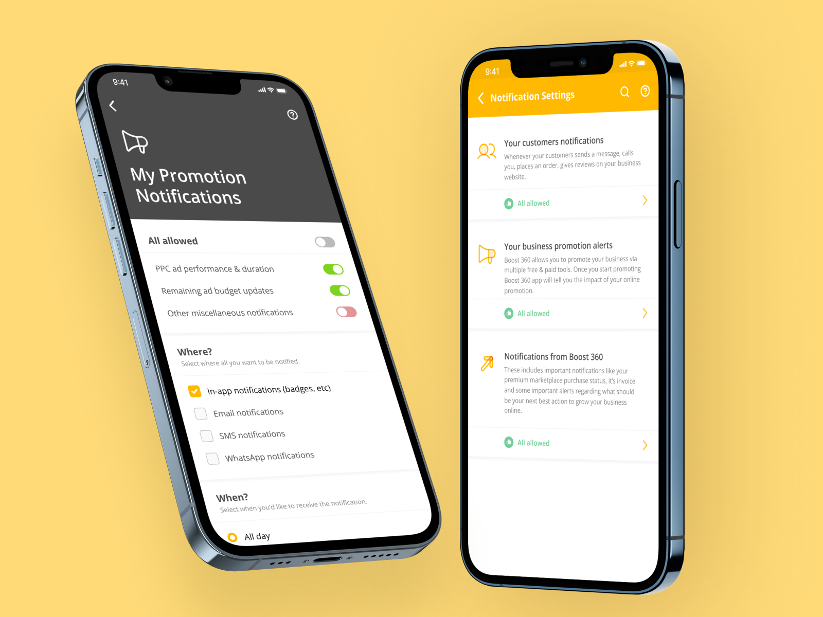
NowFloats' Boost 360 serves merchants who think about their business first and software second. These are people running physical shops, not power users looking for advanced features.
Every confusing screen means a support call. In a unit economics model, that call erases the margin on the product. My job was to design flows so simple that support tickets become exceptions, not the rule.
Product
Boost 360 by NowFloats
My role
Lead Product Designer
Timeline
2022
Skills
Product Strategy, Unit Economics, Merchant UX, Mobile Design
Business Model and Unit Economics
Boost 360's margin is thin. The product is priced for merchants earning 10-50 lakh annually. That means every hour of support is a margin killer. An unusually confusing flow isn't just UX debt. It's a direct hit to profitability.
This changes how you think about design. You're not optimizing for feature richness or cutting-edge interactions. You're optimizing for clarity and self-sufficiency. If 95% of merchants can complete a flow without calling support, the product works. If 70% need help, it doesn't.
Three Core Design Problems
Problem 1: Plan upgrades. Merchants stay on free plans because they don't understand the value of paid plans. The opportunity: surface the specific features they're currently blocked from using, then present the upgrade as unlocking something they already want.
Problem 2: Notifications. Merchants were missing business-critical alerts. New leads went unanswered. Stock issues went unnoticed. The problem wasn't volume. It was structure and prioritization. Notifications arrived undifferentiated.
Problem 3: Website builder. Non-designers need to customize their business website. The naive solution: give them total control. The realistic outcome: they break the design and call support.
Strategic Design Choices
Contextual, not abstract
Upgrade prompt appears when merchant hits a feature limit, not on a separate pricing page. They see exactly what they're missing.
Four categories, four channels
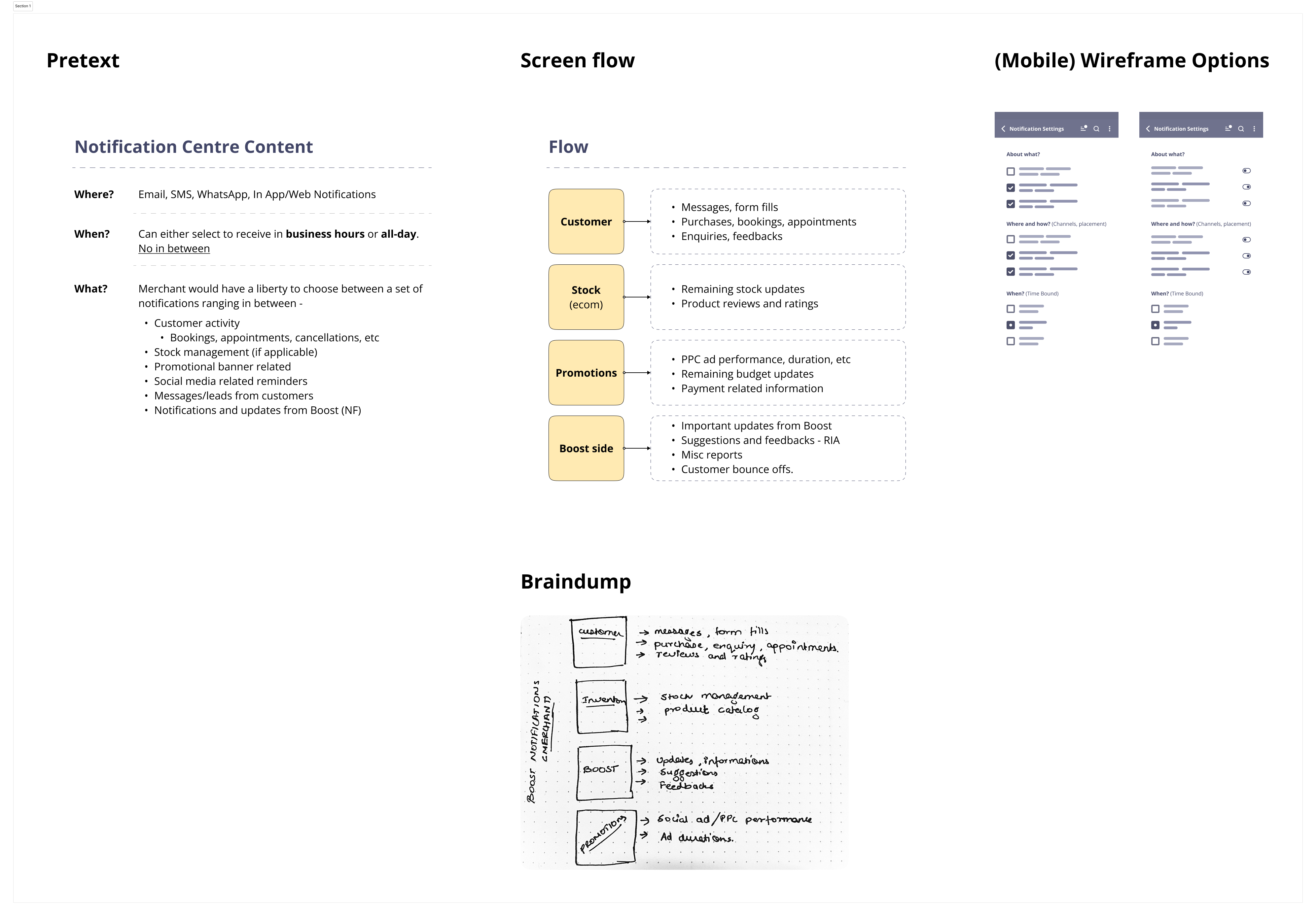
Customer, Stock, Promotions, Boost alerts routed to Email, SMS, WhatsApp, In-App based on urgency. Users control their own notification flood.
Shuffle-first, not blank canvas
Merchants shuffle through curated templates and color sets, not a blank page. Every choice produces coherence by design.
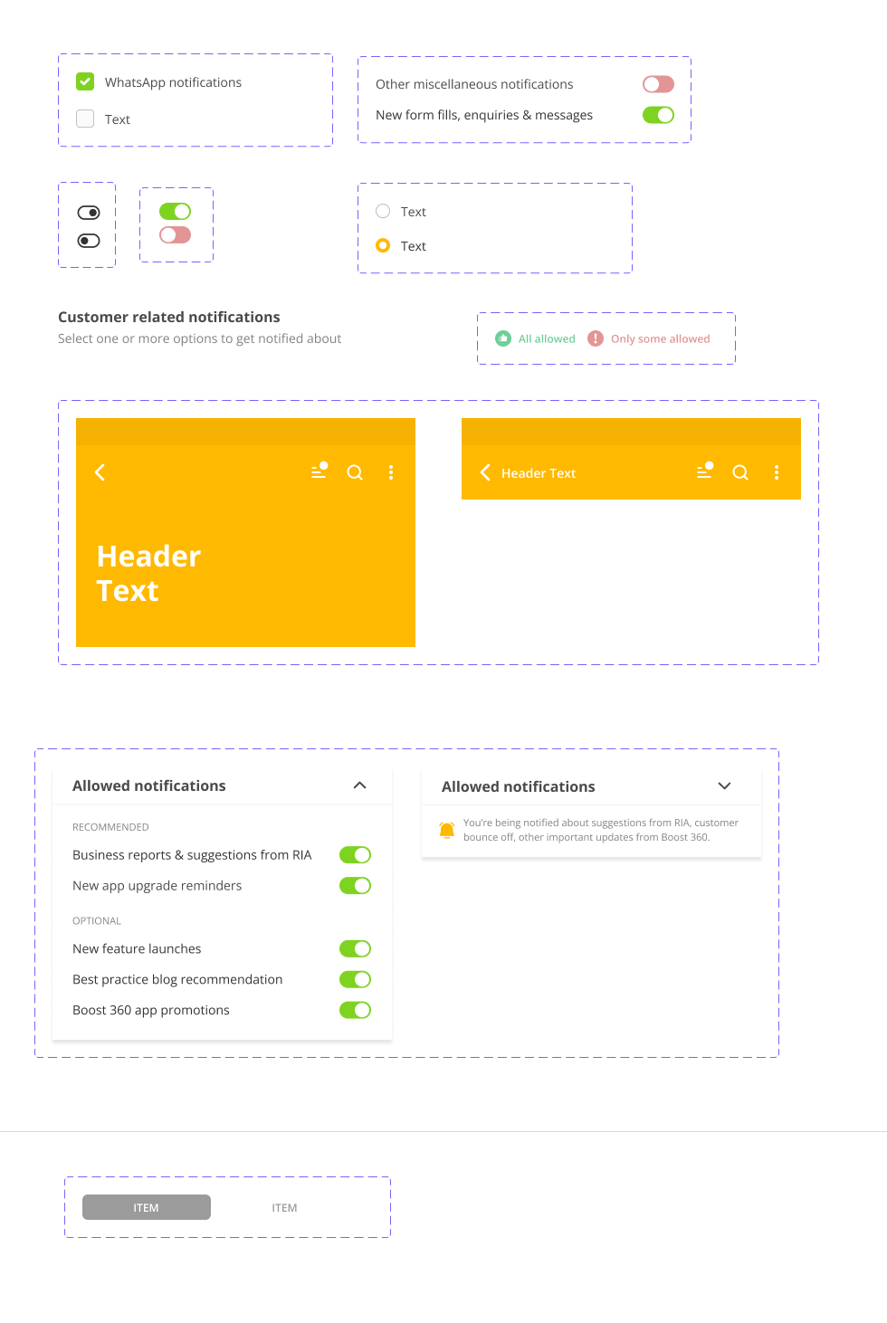
The Notification Center: Category and Channel Strategy
Merchants receive four types of alerts: customer-related (new leads, inquiries), stock-related (inventory changes), promotion-related (campaign performance), and platform-related (billing, features). Each has different urgency and communication preference.
Customer alerts are time-sensitive. Merchants want instant notification via WhatsApp or SMS. Platform alerts are informational and can wait for in-app or email.
I mapped alerts to channels based on urgency and user preference, not uniform delivery. This prevented notification fatigue while keeping critical information flowing.
AirBuilder: The AI Website Builder
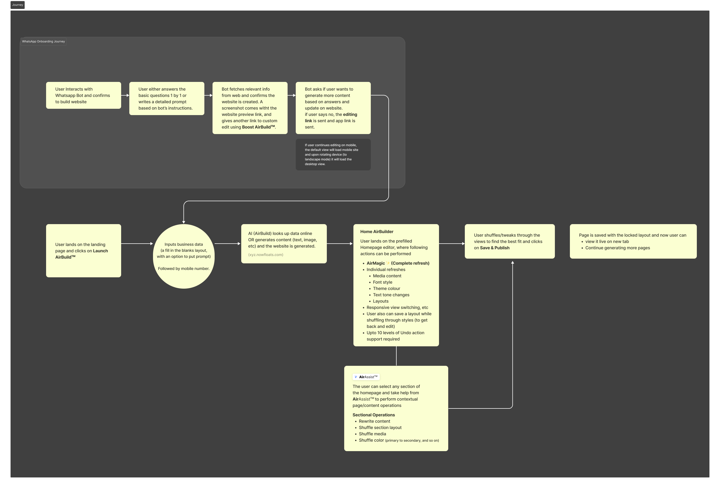
AirBuilder is the most ambitious of the three flows. The premise: a merchant with no design experience, no copy, and no time should walk away with a live website in one session.
The product decision was to do the thinking for the merchant. They provide business context (name, location, category). The AI pulls data from Google to pre-populate content or generates from scratch. They shuffle through templates, colors, and layouts. The system ensures coherence.
This is the opposite of WordPress's approach (total flexibility, total responsibility on user). But it's honest to the user's capability and time.
Brief the AI in seconds
Business name, location, category. AI pulls from Google or generates fresh content. No blank page anxiety.
Shuffle-first, not edit-first
Merchants select from pre-curated templates, colors, and sections. Every choice maintains design coherence.
BelAssist: contextual AI editing
When merchants want to go deeper, BelAssist offers inline rewrite, tone adjustment, and section rearrangement. Still no blank canvas.
Live preview and one-click deployment
Merchants see their website come to life in real-time. Deployment is one tap.
Measurable Business Outcomes
Support ticket volume
Downward trend after each flow launch. Contextual guidance reduced confusion-based support calls.
Feature adoption rates
Plan upgrades: 34% conversion rate from contextual prompt. Notification center: 89% adoption after launch.
Website builder completion
78% of merchants who started AirBuilder completed and published a website in one session.
Merchant retention
Merchants using all three features showed 2.3x higher retention than those using only the core platform.
The Broader Lesson
Design for low-income users isn't about less. It's about honest constraints. These merchants have less time, less technical background, and less patience for friction. So you design with guardrails instead of freedom. You offer shuffle-first instead of blank canvas. You make context matter. This isn't dumbing down the product. It's designing for real human constraints.